A cleaner, calmer, more accessible way to read.
This update brings together three meaningful improvements for the reader: new typography options for readers with specific needs, a redesigned panel experience that keeps your attention on the book, and a broad set of reliability and accessibility fixes across the board.
What's new
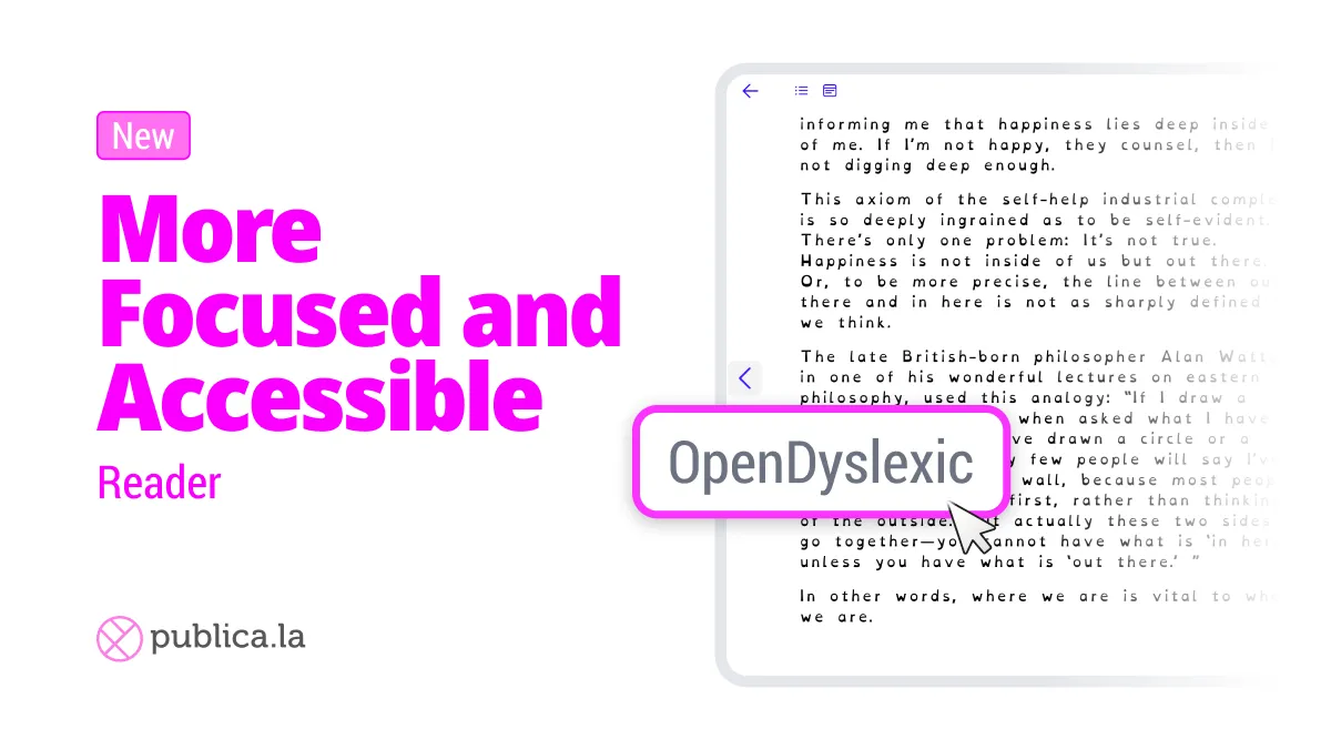
Accessible fonts — EPUB only: Readers can now choose between Literata, Inter, JetBrains Mono, and OpenDyslexic — a font specifically designed to improve legibility for readers with dyslexia — directly from the typography settings. This option is available for reflowable EPUB content only.
Unified reader panels: Table of contents, notes, highlights, search, and settings now live in a single, consistent panel system. The layout is cleaner, the tools are better organized, and the whole interface gets out of the way so you can stay focused on the content.
Stability and accessibility polish: Dozens of targeted fixes across cover rendering, navigation, keyboard interaction, and EPUB handling make the overall experience smoother and more reliable — especially for users relying on assistive technology.
💡 Result: A reader that feels lighter, more focused, and adapts to how every reader needs to read.
📣 Heads up: These improvements are being rolled out to each storefront progressively. If your store doesn't have them yet, don't worry — they'll be available within a few days.